HOW TO READ GEOFOLD OUTPUT
by Chris Bystroff, RPI Biology
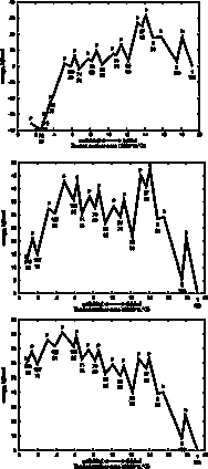
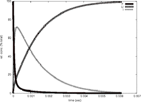 Timecourse
GeoFOLD does its thing with your protein, producing a directed acyclic graph (DAG) of all topologically possibleintermediates of unfolding, each with calculated transition state energies. Starting with the DAG, UnfoldSim calculates the timecourse of unfolding. The native state concentration is initialized to the value CONCENTRATION in the parameters file. All other nodes are initialized to zero concentration. At each time step in the time course, the concentration of each node is updated based on the concentrations of all nodes connected to it. We plot in "F" the native state and any states that have at least 90% of the buried surface area of hte native state. In "U" we sum the concentration of all states that have less than 1000 Å of buried surface area, equivalent to a typical 10 residue segment. In "I" we plot the summed concentrations of all other, intermediate, states, not F and not U. The simulation ends when the protein is half unfolded (if HALFLIFE is set to 1), or when there are no further changes in concentration (HALFLIFE set to 0). If FOLDIING is set to 1, then the simulation is initialized with the unfolded state having non-zero concentration, and all other states including the native state set to zero concentration.
 Age Plot
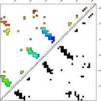
This image is a contact map of the protein, colored by the order in which contacts are broken in the unfolding pathway. Red are contacts broken early in unfolding, then yellow, green, cyan, and finally blue are contacts that are broken late in unfolding. The contacts are ordered by "age" which is defined as the sum of the concentrations of all states that contain the contact in question. Age is higher if the total concentration of states having that contact is higher. The Age Plot is calculated at the point where the concentration of unfolded (U in the Timecourse) first passes 50% (first drops blow 50% if FOLDING = 1). The Age Plot can be used to identify early folding intermediates (blue contacts), and early unfolding segments (red contacts), and to identify contacts that have topological dependencies.
In the case shown here, the C-terminal is the first to unfold. Of the three beta hairpin structures in this protein (clusters of contacts perpendicular to the diagonal), the third is the most enduring, remaining until the end either for topological or energetic reasons.
 Pathways
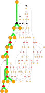
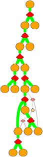
GeoFOLD pathways depict a subset of the states in the directed acyclic graph (DAG), elected according to the flow of traffic through the graph in a UnfoldSim simulation. The pathway you see (and all other results for that matter) depend on the settings for TEMPERATURE, OMEGA, and all energies, entropies and cutoffs. Orange nodes are structural states, with the native state at the top. Diamonds are transition states, red for pivots, black for hinges and white for breaks.
Clicking on one of the nodes will give you some specific information on the structural state or transition state. For example, clicking on an orange circle node give this info:
ISEGMT 2 2 0 6665.21 98.67 0 35 0.056048164
BBBBBBBBB..........AAAAAAAAAAAAAAAAAAAAAAAAAAAAAAAAAAAAAAA 1- 9, 20- 58
Columns in the first line (ISEGM) are
2: Segment number
3: Graph depth from native
4: Number of symmetry equivalent segments in this protein
5: Buried solvent accessible surface area
6. Unexpressed sidechain entropy
7. Number of buried void spaces
8. Number of hydrogen bonds
9. Final concentration (at half-life or equilibrium, depending on HALFLIFE setting)
The second line shows the residue positions present in this structural state. In this example, residues 1-9 and 20-58. The string shows that the two contiguous segmetns are being treated (internally) as separate chains. This is done because the connecting segment (residues 10-19) are already unfolded at this stage of unfolding.
 Clicking
on a diamond node gives:
Clicking
on a diamond node gives:
TSTATE 70 1 2 105 0.35 h 0.7768
Columns in the TSTATE line are
2: tstate number
3: ISEGMT f , number of the incoming structural state
4: ISEGMT u1, number of the outgoing structural state 1
5: ISEGMT u2, number of the outgoing structural state 2
6: Entropy of this transition relative to the most flexibe transtion of this cut-type
7: Cuttype = b: break, p:pivot or h:hinge
8: Traffic through this TSTATE as a fraction of all traffic coming from ISEGMT f.
Bold states and thick green lines mark the unfolding pathway with the highest traffic. Other pathways with non-zero traffic are shown as smaller, dimmer nodes and thin lines. Pathways with near zero traffic are not drawn. (Note, that a simulation of unfolding under folding conditions will show only the folded state! A very boring graph.)
Interpretting
the graph
The overall nature of this graph
depends on the protein and the conditions of unfolding. A protein with lots of
topological complexifies or with disulfides will have one or more hinge (black
diamond) nodes. Multiple chain proteins will have breaks (white diamonds) where
subunit chains 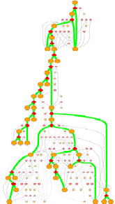 (or
segments sparated by an unfolded segment) are physically separated during
unfolding. Loosely bound subunits will
disocciate early in folding, shown by white diamonds at or near the top
of the graph.
(or
segments sparated by an unfolded segment) are physically separated during
unfolding. Loosely bound subunits will
disocciate early in folding, shown by white diamonds at or near the top
of the graph.
A protein with many alternative unfolding pathways will be wide, having many options for unfolding traffic. At higher omega (lower virtual urea), closer to the melting point, the paths may reduce to one dominant pathway. This happens because the higher desolvation energy accentuates the differences between pathways.
A tall graph such as the one shown on the right, with lots of short branches has a single predominant pathway characterized by the "peeling" of short segments from the surface, like a ball of string.
Some unfolding pathways, such as the one to the right, have multiple long branches. The length of a branch is roughly proportional to the size of the state at the branch point. This graph splits into two large segments at depth 6, and one of the resulting children immediately splits again.
Also note in this image that more than one thick green line can end in one ISEGMT node. How can this happen, since a given segment can only unfold once? This happens in multimers, because symmetry-related segments are assigned the same state.
Energy Profile
 With
some loss of information, we can visualize the folding pathway as a familiar,
linear reaction coordinate, with unfolded on the left and folded on the right.
Intermediates along the pathway have coordinates along the reaction coordinate
(the X axis), represented by the buried surface area, and also in the energy dimension
(the Y axis).
With
some loss of information, we can visualize the folding pathway as a familiar,
linear reaction coordinate, with unfolded on the left and folded on the right.
Intermediates along the pathway have coordinates along the reaction coordinate
(the X axis), represented by the buried surface area, and also in the energy dimension
(the Y axis).
In these plots we have projected the unfolding tree of highest traffic (maxTraffic tree, shown in green lines in the pathway images), onto a single dimension by summing the energies of intermediates that have the same number of steps from the folded state. Since we are projecting a single pathway tree, and because each elemental unfolding step produces non-overlapping substructures, each residue is counted exactly once for each intermediate in the 1-dimensional projection.
Since the tree is of the bifurcating type, the number of intermediates represented goes up by a factor of two for each step in the energy profile. Transition state energies are plotted for just one of the elemental unfolding steps at each level of the tree, specifically the one with the highest barrier. This is generally also the largest chunk. Because information is lost in this step, there will sometimes be transition states that are plotted below one of the ground states, always the one on the unfolded side. Whether the simulation was set to unfold or fold, only the transition state energies in the unfolding direction are meaningful. (I am still looking for a more clever way to project the tree into one dimension. Please send your idea if you have one!)
The "cuttype" (b: break, p:pivot or h:hinge, NOTE: m:melting steps are ignored in the energy profile.) is plotted as a single letter above each transition state. The node number of the largest chunk at each step is plotted below each ground state, and below that number is the size of that chunk in residues. You can see that the reaction coordinate (buried surface area) roughly correlates with the size of the largest chunk.
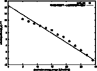 ln(ku)
vs ω
ln(ku)
vs ω
The unfolding rate (ku) and folding rate (kf)
are expected to be log-linearly related to the surface tension (ω), because the height of the
transition state is dominated by the desolvation free energy, which is equal to
ω
times the
change in buried surface area between the ground state and the transition
state. For unfolding, the ground state may by the fully folded state or
possibly a more stable intermediate. The slope of the log(ku) vs ω is
called the kinetic m-value, and it is plotted here as a least squares linear fit
to the data. The line can be extrapolated to the surface tension of
water (unknown for GeoFold, since we have user-defined parameters, but for the
defaults we think it is around 50 kJ/mol/Å2). Note in this example
that the data is not log-linear but shows an increasing slope with increasing
surface tension. Although this
still may be artifactual, we think it could be due to a shift in the position
of the transition state with a change in ω.
It could also be due to low-energy intermediates appearing at
higher ω values.